News
Candid Interview: Turner Duckworth
In the first of our ‘Candid’ Q&As, we speak to Chris Garvey, Executive Creative Director at award-winning branding agency Turner Duckworth, about the design possibilities of the beverage can, the sustainable benefits of the packaging format, and the agency’s celebrated work for Coca-Cola.

Chris, you’ve worked with Turner Duckworth for more than 15 years, in which time the agency has grown from a small packaging studio to one of the most influential branding agencies in the world. The agency has also scooped numerous awards for packaging design, including three prestigious D&AD Pencils for its work with Coca-Cola. As a canvas, what are the advantages of working on a beverage can over other drink packaging formats?
Packaging is an essential proving ground for your brand. The front-of-pack, on a crowded shelf, has only a fraction of a second to grab your attention and convey the brand personality and product offering. It forces designers to focus on the few, most necessary design elements that are legible from a distance, emotive, and distinctive for the brand. It’s a good practice, not only for packaging, but also for the entire Visual Identity system.
As for cans, the materiality first comes to mind: you can play with overprint vs printing directly to really elevate your design. In terms of creativity, you cannot see the product within, which requires the brand to stand for something bigger and more emotive than taste appeal. There’s also an interesting challenge in being given a ubiquitous form and coming up with a design that encourages people to look at it anew.

Can you talk us through the design process for your D&AD winning entry?
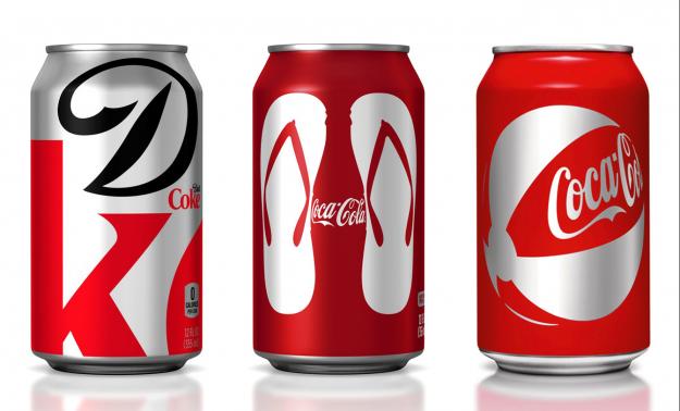
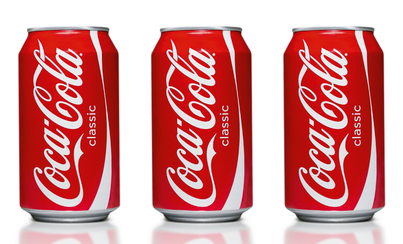
The Visual Identity for Coke started with and centered around the can. Years of marketing teams leaving their legacies resulted in an additive design that buried the can in complexity (halftones, dew drops, drop shadows, inlines, several ribbons, etc.) Coke is a brand everyone knows and has grown up with. You can ask a stranger on the street to draw a Coke can, and you will likely end up with a high consistency rate… though, they would not be drawing those halftones and dew drops.
We challenged the client team to focus on the few elements that have been there since the start and are immediately identifiable by anyone (red, white, the script, and bottle). The result was something that was timeless, and modern at the same time. This became the toolkit for any and every activation for the rest of the Visual Identity. Whether it was other packaging formats, vending machines, trucks, POS, or stadium graphics; we used those few elements to make the brand unmistakable and played with context and wit to show up in surprising ways.
This took immense bravery from the client team. At the time of the redesign, very few major brands were willing to take the risk of being boldly simple and iconic. The risk paid off and set the standard. We are still seeing brand redesigns in 2021 where there is a deliberate effort to focus on the few, timeless and unmistakable equities.
The drinks can is the most recycled beverage container in world. How important are the sustainable credentials of a packaging material when answering a design brief?
Sustainability is showing up more often in client briefs and we’re excited about this challenge. Younger consumers are really pushing brands on this front. The key is to find ways to use sustainable materials that fit the brand in an authentic way, like the Heineken keg can.
A growing number of brands are adopting the use of UV and thermochromic inks, and innovative engineering techniques such as embossing and shaping. In terms of design possibilities, what does the future hold for the beverage can?
The can has been designed to be one of the most efficient forms in regard to weight, capacity, materiality, transportability, ergonomics, and graphics. It can seem like there is a very narrow margin for change. But any good design challenge is defined by its restraints. Limitation encourages innovation.
And again, the use of these innovations needs to be relevant to the brand. With our first thermochromic design brief from Coke, we thought about simple tactics, like colorizing the logo, but that wasn’t exciting enough. We landed on an illustration of the bell glass that revealed ice cubes within it when the can was at the perfectly chilled temperature for drinking — it was a choice that highlighted the innovation, but the result was something much larger.
Regardless of what’s to come, my advice to designers would be to think about how that innovation can be elevated to a surprising storytelling moment for the brand.


